High impact 3m x 2m bespoke exhibition stand

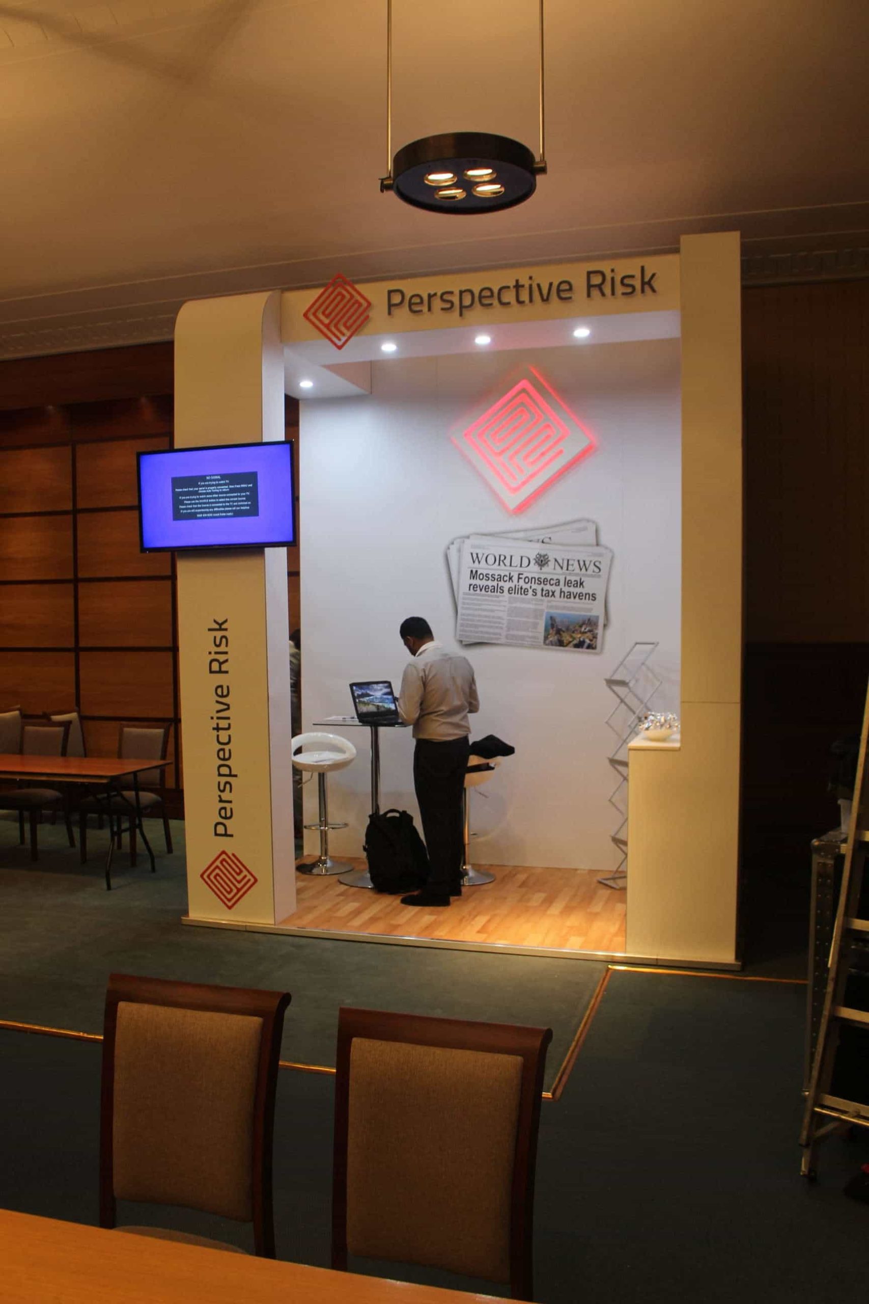
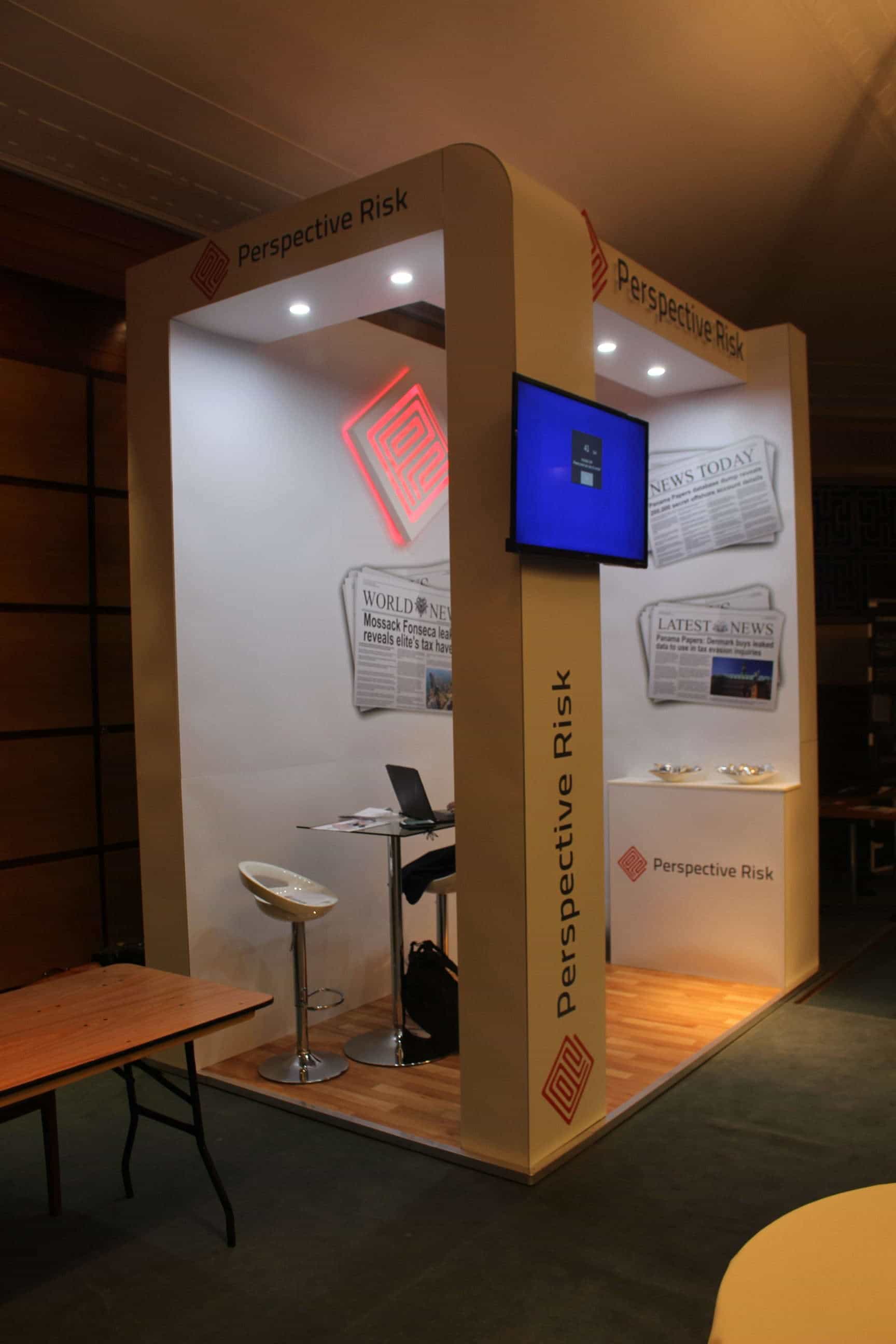
This stand is a perfect example of what can be done with a small space! The brief received from the client was to create something eye catching which would stand out from the other basic stalls and tables at an indoor conference in a well-known London hotel, and we think that was successfully achieved. It was a 3x2m stand space and with only a 1 hour window for installation, it was a big challenge for the team but the deadline was met and it was completed in time for the conference opening. The stand stood at a height of 3m which added to the presence and ensured it was seen from around the room, attracting attention from delegates which is obviously [highlight color=”green”]the main aim of an exhibitor[/highlight].

The curved column on one side of the stand created a softer and welcoming look which the client also wanted to achieve. A shelf was added inside the stand to give the client essential display space and it was also wrapped in graphics which blended in nicely with the overall stand. Even with a small space, being able to display products and services sufficiently is a critical factor for any exhibitor and the client also wanted to use a literature rack for brochures and leaflets which was placed in the back corner of the stand. The logo was created inside the stand using LED lighting strips and was also cut separately and mounted onto the wall.
Exhibition Stand focus points
- Very short install time
- Highest impact possible with keen budget
- Company logo at good height
- Looping media
- Clean yet bold graphics
The client used bold but minimalistic graphics which is another essential factor when [highlight color=”green”]designing a successful stand.[/highlight] Graphics that are too ‘busy’ and full of text end up losing the attention of visitors and won’t always get the point across sufficiently. Despite the small area, the client was still able to have a table and two stools inside the stand to sit and chat with visitors and prospective clients. A 42” screen was also mounted on the front column which faced out into the conference as the client wanted to run a looped presentation of their products and services. This enabled visitors to stand and watch the presentation and then the client was able to discuss it further with them on the stand. A wooden effect vinyl covering was placed on raised flooring and finished off with aluminium trim around the edge of the stand. [highlight color=”green”]The overall look of the stand was clean, bright and striking[/highlight] and more than met with the client’s brief for an eye catching and attention grabbing stand that would impress at the conference.


