Bespoke display stand with 3d company logo

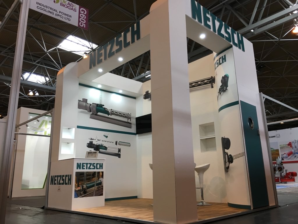
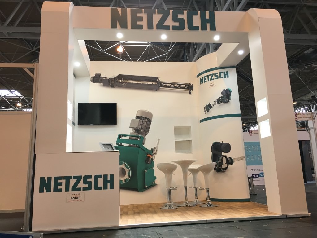
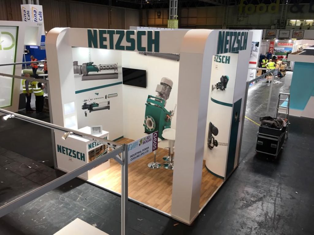
Our client Netzsch Pumps had a 4x3m stand space and wanted a bespoke looking stand which would really stand out from its shell scheme neighbours in the hall. Our designer visualised a bright, tall and clean stand with enough stand space to allow furniture and a worktop as well as incorporating a store into the design as well. The client got a light and impressive stand which they were delighted with. The structure of the stand consisted of two open sides with two curved pillars at the front.
The back of the stand had a small semi-circular enclosed pillar at one side to create the storage area which proved invaluable for the client to store literature and product information during the show. Access to the store was through a lockage door with porthole on one open side which still allowed easy access onto the stand by visitors. Shelving was built into both of the front pillars for literature to be easily displayed and [highlight color=”green”]LED lighting[/highlight] was placed on the inside of each shelf to really emphasise the company brochures and information. A worktop/counter top was incorporated into the design at the front of the stand which had an ipad stand placed on it, secured down using extractable wire. This allowed the client to show their products online to visitors and also provided the staff working on the stand space to make notes and take down visitor details. A screen was placed on the back wall of the stand enabling looped presentations to be made and information to be shown at regular intervals. The stand was dressed in custom printed graphics, approved by the client, and featured the clients’ product in life size on the back wall.


This was specifically required so that the client didn’t have to bring in an actual pump onto the stand. It was a great way of showing potential customers what the product looked like in real terms. The graphics were bold, bright and straight to the point, displaying the product clearly and concisely. The real striking element of the stand, however, was the header at the top of the stand with the client’s name in huge 3D effect lettering on two sides. It really made the clients name and stand visible from all corners of the exhibition hall, drawing visitors to it and really grabbing the attention of passers-by.
Exhibition Stand focus points
- Tall clean and minimal
- Storage area with lockable door
- Company logo 3d cut at high poisition
- Large true to life size graphic of products
It worked exceptionally well and was a great finishing touch to the whole structure. Lighting was placed on the underside of the header, [highlight color=”green”]flooding the stand with light.[/highlight] A wood effect vinyl floor covering was placed on a raised floor and trimmed with aluminium. Once the white table and stools were placed on the stand, a very happy client was ready for the show opening the next day.


